How I Added Multiple Blog Post Columns to my Site
Published 5 September 2018 in websites
I'm always changing the design of my web pages to my liking, and one of the ways I can do this easily is with CSS. I love the theme that I chose for my blog, the Savona Theme by Optima Themes, but I couldn't find any options that would allow me to change the number of columns on my site's posts page when I was looking in the WordPress customizer. Taking matters into my own hands, I found a super quick solution to my problem with the power of CSS that can be done in five easy steps!
Step 1: Identify the element you need to change.
After you open the WordPress customizer either through the top bar or the dashboard menu, open your browser's development tools by pressing Fn+F12 or F12 on your keyboard if you're using a Windows OS or Command+Option+I if you're using Mac OS.
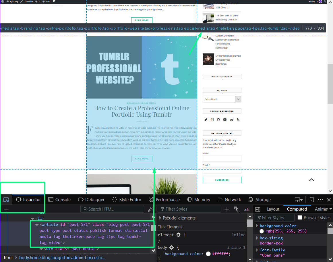
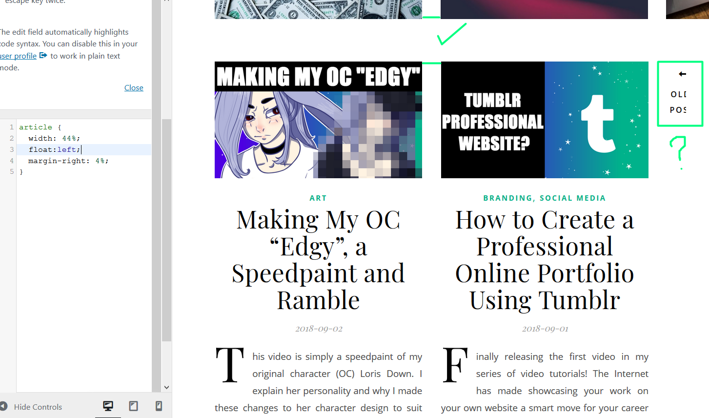
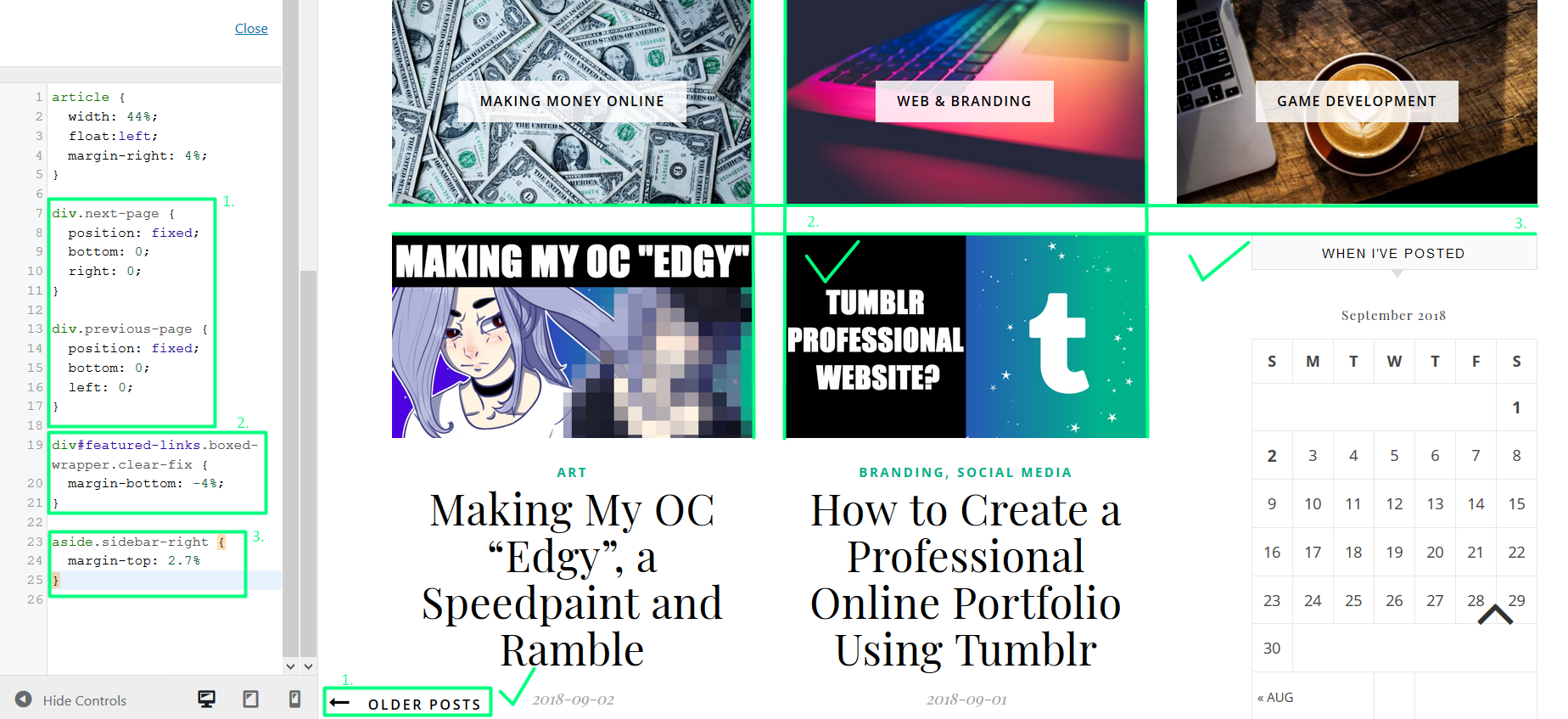
Next zoom out your browser window until you can see the entire element that you want to change. Click on the little arrow icon on the inspector tab of the development tools and hover your cursor over the element until you have highlighted the entire element like so. You'll see the entire name of the element as a tooltip above it as well as selected in the HTML code in the inspector tool. You may not have to type out the whole thing to be able to target the element you want. In my case, all I had to do was type article in my Custom CSS. However, it's safer to choose a longer path to avoid messing up an element with the same article tag on another page. For this reason, I've elongated the name to ul.blog-grid li article because the full article was being changed, too. Here is the new code:*
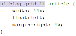
Step 2: Changing the width.
I like my spaces to be very even on my web pages, so I chose to give my posts a width of 44% so that the width of the preview images would line up with the width of the featured links images as well as allow only two posts side-by-side. It's importance to use percentages in this case to ensure a smooth transition when you change your browser size.
Now the only question is how to get the second post to slide up alongside the first post?
Step 3: Positioning the element.
To make the posts slide up, all you have to do is add float: left; to the post element. I also added a margin-right: 4%; so that the spacing between the post images matched with the spacing between the featured links images.
Below you can see my code in the Custom CSS section so far. You'll notice that elements surrounding the posts might be a little messed up, but we'll deal with them in the next step.
Step 4: Clean-up.
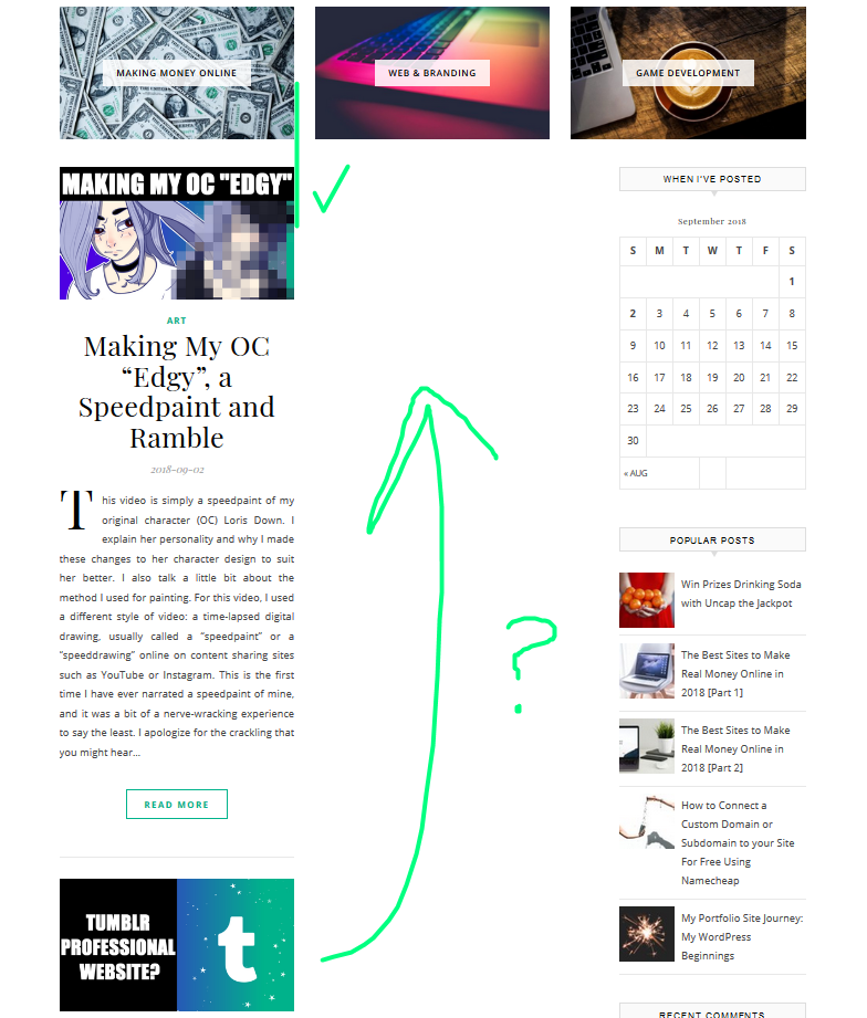
The following pieces of code I added after the post code to fix up the elements around my post that I didn't like. Firstly, the pagination elements to see older posts and newer posts are now fixed to the bottom left of the page, so they don't get in the way of anything else and are easy to see at any time. Secondly, the space between the top of the posts and the bottom of the featured links forms a perfect square with the space between the featured links and the post images. Lastly, the top of the widgets matches with the top of the post images.
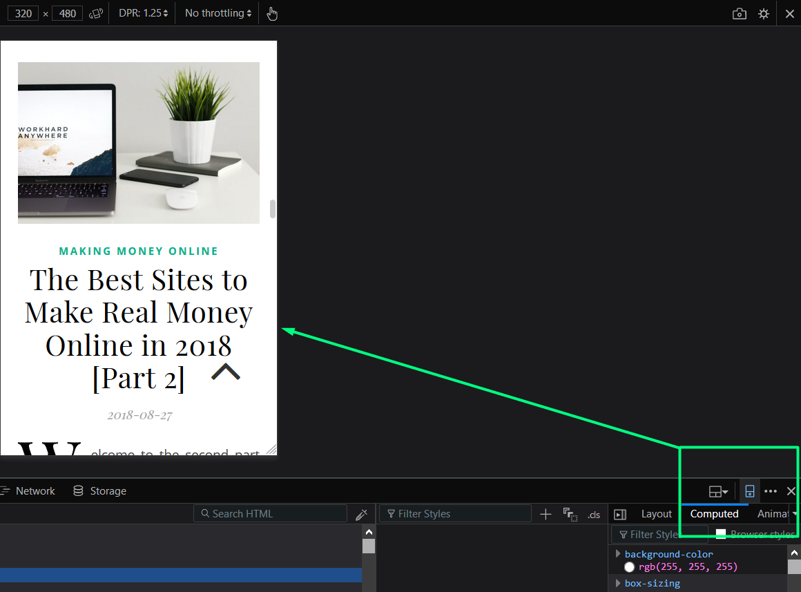
Step 5: Fixing the mobile design.

THE HORROR
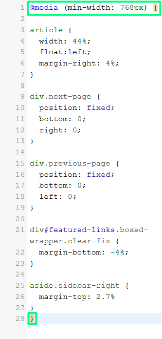
After clearing your phone browser cache, you'll see that the two columns look terrible on such a small screen. To fix this, simply add a media query encasing the new CSS you created so that your two column layout only appears on tablets and computer monitors. Below you can see the complete CSS code and a demonstration that my site now looks better on mobile.

Beautiful.
By the way, you can access a mobile view of your site without having to pick up your phone thanks to your development tools. Just click this small little phone icon along the top right of the tools, and you'll be able to see your changes much more quickly.
Resources:
I didn't use any resources to create this tutorial - just trial and error. I have included below a few guides on the developer tools of the three most popular browsers because there's so much more that you can do with this digital web development toolbox!
And here's a great website for referencing CSS and learning web programming languages:
Images:
- Photo by Samuel Zeller on Unsplash
- Screenshots of my website by me
Edits:
*Element name changed to ul.blog-grid li article.

I'm Liz, the front-end web developer who made this static blog. My writings on here cover art, programming, and working on the Web, but I no longer regularly update this website. Check out my developer portfolio.